Primary Logo
This is the preferred version of the logo for all Puget Sound communications. We present our logo simply in maroon or black, most often on a neutral or uncluttered background. It also may be reversed out of a maroon square in certain applications. It should never be smaller than 5/8 inch (.625 inch) wide. Please reach out to us at communications@pugetsound.edu to get appropriate files for your logo usage.
Text Version
If it is not possible to use the logo, even at minimum size, it is acceptable to use a text-only treatment.
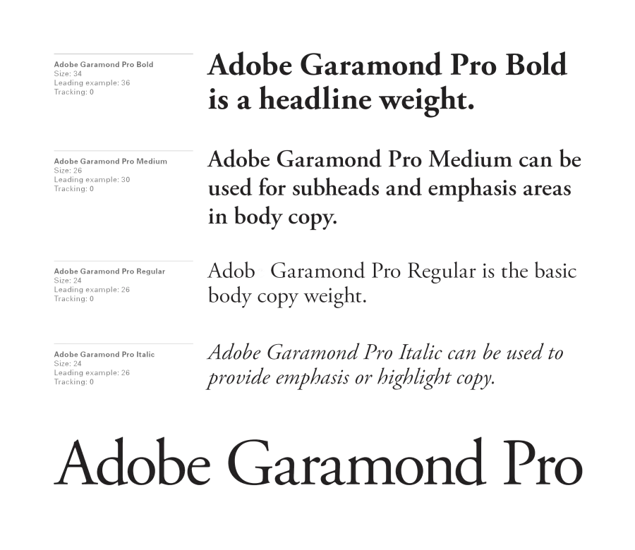
Adobe Garamond Semibold, tracking of 50, all caps, black or Pantone 188 (or reversed on color backgrounds) at no smaller than 7.5 point.
Department and Division Logos
All departments and divisions use the college logo. Department names appear in title case to the right of the logo. Logo combinations, or “lockups,” should be requested from the Office of Marketing & Communications.
Alternative Lockup
In some instances, one- or two-word department names can appear below the logo. This treatment should only be used when the department name is short enough to appear no smaller than the word “University” in the logo.
Program Logos
Use of the primary logo is strongly encouraged on all applications. Program-specific logos may be developed in certain cases, but there are often other ways to visually distinguish programs, events, and initiatives. Please consult with the Office of Marketing & Communications for guidance.
Athletics Visual Standards
Athletics has a separate but complementary logo and visual standards system. Please consult with athletics for more information.
Historic Seal
The seal is not a logo and should be used only on official, formal documents from the Office of the President or in
Commencement materials.
Environmental Graphic Design
Our campus expresses our brand through its architecture and use of interior and exterior spaces to communicate mission, values, and key messages. Consider messaging and visual standards when making choices about campus signage, wall colors, art selection, banners, furnishings, or other physical materials.
Photography/Videography
We choose imagery that conveys our brand messaging, exemplified by the phrase “purpose and impact.” Photos should be active and illustrate collaboration and connection between people and each other or the environment.


